ZOOM IN.
ART ON THE WILD SIDE.
9.05.2010
Collaborative Work:Photoshoot


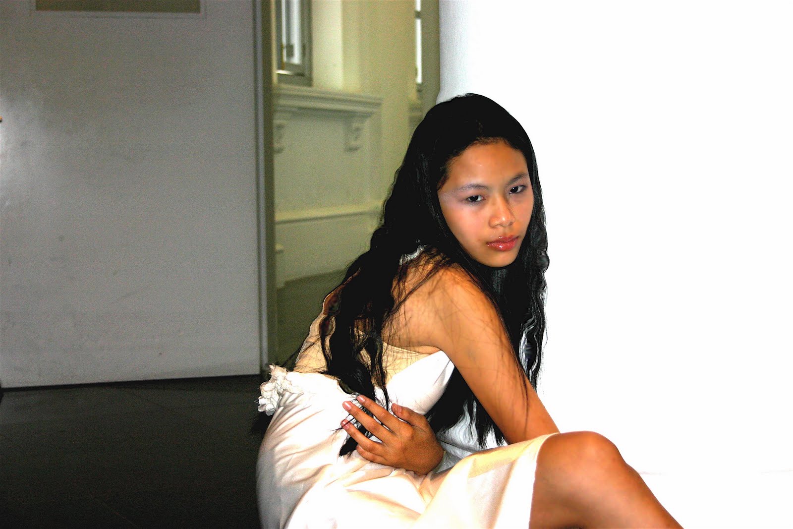
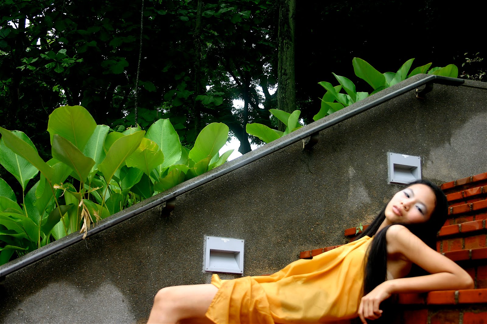
These photos were taken as our collaborative work; Grace and Jubilee made the dresses they modeled for, Tze She did the photography and Hui Sze edited the photos.
7.07.2010

The Ancient’s Edge

Puah Hui Sze

Gel ink pen, poster paint, water colour, glitter glue

2010

This is a painting of a temple in Taiwan. It was actually painted from a photo my mother took when she was in Taiwan. I first used a 3B pencil to draw the outlines of the temple, then, I used a black pen to sort of trace and add in the ‘dynamics’. The “dynamics” refer to the sketchy and really fast and edgy lines with varying thickness and texture. The drawing was then painted using water colour as the base, and the details were added using diluted poster paints. The Ancient’s Edge was a challenge as I used limited colours of diluted poster paints: dark olive green, apple green, dirty green, white, moss green, blue, red and brown. The colours used may be strange as the majority is green. Even the dark brown I used to paint the bricks was also the result of mixing moss green and red. Thus, this painting enabled me to explore the possibilities of using limited number of colours to create several other colours. I tried to make the colours appear as though they were being smudged and Photoshop-edited-image effect. I changed the ruined portion of the temple by simplifying it, deleting the other extra lines, leaving the essentials. I purposely added glitter on the outlines of relieves so as to draw the attention of viewers. I made the relieves as the focal points as I want viewers to know that this is a stylized piece of artwork, which the image of the temple is quite prominent in proving so. I thought that quite a number of artists may paint this temple as realistically as possible, thus, I wish to differ. I made the temple look as simple as possible, concentrating on the overall rather than going into the details of the form.

6.30.2010
Stair


Stair
Puah Hui Sze
Photography
2010

This is a photo of a portion of stairs in a boat cruise. I went for a cruise trip around the straits of Singapore. I really like this flight of stairs; hence, I took this photo when I was coming down from the second level of the boat cruise. There is a sense of movement in this photo due to the perspective in which I took this photo from. This is because the stair seems to be very steep, as though someone is sure to fall if he were to be on this stairs. I chose to take from this perspective as it is more exciting for viewers to take a look at what it looks like at the instance when one is falling from a height. This photo successfully captured that fleeting moment when one is about to fall, with clear defined forms. In this photo, I captured a portion of a man's legs at the top left hand corner. This was actually inspired by Edouard Manet's artwork, Bar at the Folies Bergere. Manet painted an acrobat's pair of legs at the top left hand corner to puzzle and mystify viewers, giving them something to ponder about. This was why I employed Manet's brilliant technique to intrigue viewers further, like there is actually a man waiting at the end of the staircase...
Wild Thing

Wild Thing


Puah Hui Sze


Clay, silica paint


2010

This is one of my works for this year's assignment. This is a monster made from clay. It is an incense burner that one uses for aroma therapy. This monster has hair that is rotten, which are actually Rafflesia's petals. It has a slimy and old body in a sickening shade of green. The inside of its mouth is magic blue, and has a relatively smooth surface. The dish used for containing plant oils has a tiny, sad but bloody grey bunny in it. I wanted to make my Wild Thing as scary and gruesome as possible, maybe even gory. Hence, I drew one hole into each of its eyes, so that when the candle is lit, light can be seen shining throug its eyes. To make the eye look catchier, I carved simple designs that look like eyelashes. The colour combination of the Wild Thing was inspired by Paul Gauguin's selection of primitive colours, but primitive colours chosen by me were quite muted. The choice of colours for my Wild Thing was also due to the habitat of this Wild Thing--jungle.
Swan


Swan
Puah Hui Sze
Origami papers, glitter glue
2010
This is a 3-dimensional art piece of a swan. The swan is multi-coloured and some feathers have glitter on them as embellishment. This swan is colourful as it represents our group's art, full of vibrancy, brilliance and colour. This swan is something like a Lego built structure and it was painstakingly made by using folded paper parts joined together. Therefore, it means that every effort made, be it little or big, is of great importance to the final success of our group's exhibition. Though this swan was made after failures, the final product is still a success. Failures and difficulties were also what we experienced when doing our very own magazine. Thus, this swan is considered as a personification of all our hard work and a literal representation of our fruit of labour.
6.29.2010

Family

Puah Hui Sze

Pencil, coloured pencils

2003

This piece of artwork is a portrait of my family on a bridge. The background is a blue sky, with white clouds, two birds and an aeroplane. The colour of the sky was coloured lightly using light blue. In the foreground, there is a wooden bridge on the grey pavement. This bridge is actually the one in my uncle’s condominium in Choa Chu Kang. I had some difficulty in drawing the curve of the base of the bridge, thus, the arc drawn was not smooth. The form of the bridge is defined, but the colour is flat, hence, the bridge is more 2-dimensional. The pavement appears to have a rough texture as I coloured the pavement using different amounts of strength, to make darker tones of grey at some parts on the pavement. In the foreground, there is a grass patch and a portion of pond drawn. The grass patch was made up of strokes of various shades of green, giving the effect of solidity. The animals in the pond are engaging in their activities. I drew speech bubbles and thinking bubbles to show even more clearly on what the animals are doing. The animals also appear flat as the colours were untreated and there were no colour gradations.


Fruit Basket

Fruit Basket
Puah Hui Sze
Pencil, coloured pencils, markers, glitter glue
2003

The subject matter of this artwork is 2-dimensional, with bright and vibrant colours in domination. The fruits in the basket were my favourite fruits then, and the colours were flat and not spread out properly, leaving white patches, thus, look unfinished. The basket was decorated mainly with patterns. This was my very first attempt using patterns in my artwork. I used stars to decorate the body of the basket, circles and squares on the rim. The designs of the ribbons were simple shapes. The handle of this basket was decorated with zigzag lines. The colour combination in this artwork is rather suitable and colours chosen complemented each other. However, the outlines of forms are not smooth and well defined, as they are fuzzy and uneven. In the background, there are balloons, thus, giving a festive-like feeling when viewers look at this artwork.


Going Home

Puah Hui Sze

Poster paint, pencil

2005


In this piece of artwork, there are patches of colours with different patterns. These patterns were made using wooden chopstick to draw on wet poster paint. This piece of artwork is quite different from all the artworks I have done. This was considered as a daring attempt. This is because I only used sponge to dab on the fresh-the-tube poster paint and applied directly onto the drawing paper. After that, I used a wooden chopstick to create patterns on the wet paint. The final dab of coffee brown was portrayed as a house, and the pther dabs f paint represent the path back home. Each step is unique on its own, with varying patterns. I used my finger to paint the pond, to give the unfinished texture. The two ducks are complementary to the pond as the forms of the ducks are not detailed and refined. The colour of the ducks is also rather flat. To make the grass look alive, I used a comb, dip it into green poster paint and used the comb to stroke on th edrawing paper. It gave a unique effect and the tones of green varied, giving the grass its form. This artwork's simplicity is what makes it the striking one.
6.28.2010
Photoshoot: Flare for Fuchsia


Flare for Fuchsia (Fashion Illustration) [Above Left]
Grace Chong
A4, Pen, Marker
May 2010

Flare for Fuchsia (Dress) [Above Right]
Grace Chong
Dress, Cotton, Boning
June 2010

"Flare for Fuchsia" is also another dress I designed and made for the collaborative work together with Jubilee, Hui Sze and Tze She. The photoshoot picture will be featured on the magazine, Zoom In, which we will be producing.

"Flare for Fuchsia" is similar to "Sleek Silver with Lace" in the way that they are both tube dresses. However, "Flare for Fuchsia" has a flare skirt, and is more simple. It is a fuchsia-coloured dress, made using cotton. It has no contrast in colour and texture, hence making it very simple. The dress is symmetrical in shape, and balanced. The colour of fuchsia dominated the composition of the dress, and there is little sense of movement in the dress, as there is no unusual feature in it.

Again, I have used boning to emphasize the fitting of the bodice to the body. The material used - cotton, is not very shiny, hence keeping the dress as simple as possible. The simplicity of the dress, is what makes it beautiful and unique. This adheres to my intended message, "Simplicity is Key". With a few accessories, here and there, the dress will shine.
Photoshoot: Sleek Silver with Lace


Sleek Silver with Lace (Fashion Illustration) [Below]
Grace Chong
A4, Pencil, Markers
May 2010

Sleek Silver with Lace (Dress) [Right]
Grace Chong
Dress, Satin, Boning, Lace
June 2010


This is a tube dress I designed known as "Sleek Silver with Lace". This dress will be used as a collaborative work together with Jubilee, Hui Sze and Tze She. The picture beside is a Fashion Illustration of what I will create. As for the photoshoot itself, the picture will be featured on the magazine, Zoom In which we will be producing although I have taken a picture of the dress itself, which I made (shown above).

"Sleek Silver with Lace" is a tube dress fitting to the body, made up of silver-coloured satin and some lace at the waist area of the dress. I made use of little contrast of colours this time so as to make the dress look more formal, as it is intended to be (worn during formal dinners and events). The different texture used will be the lace and the satin itself. I only chose one dominating feature of the dress - lace, is because I wanted to keep minimum eye movement and let the viewer's eye to be attached to only the lace and the silk material. This also contributes to my current message being conveyed through this dress,"Simple is Key".

On the dress, I have used boning in the lining, to create form on the dress, making it more fitting and flattering to the body. The dress is kept simple, conveying my idea, "Simple is Key".